Films make fashions. Films make music. Films incite people to riot and commit murder. But do they also make us change the spaces we live in?
Do film sets reflect the latest movements in design and decoration? Or do current trends in design determine the look of our favourite films? The answer is, probably a bit of both, but because – in theory at least – films can be made quickly, their designers, can indulge in, test and launch decorative styles on a big public well ahead of contemporary taste.
Which is why, or at least partly why, the sets of so many “visionary” or futuristic films from the cabinet of Dr Cagliari in the 20’s through The Shape of Things to Come in the 50s, 2001 A Space Odyssey in the ’60s and Blade Runner in the 1980s have seen so very far ahead of their time.
It is also true that set designs no matter how ingenious and expensive can be rushed up without concern for the kind of practical detail that workaday designers and architects have to devote painstaking attention to.
So set designers can present us with buildings that would never work in reality and wilful madcap interiors.
Great sets in great films definitely have the power to shape contemporary taste and to bring the work of otherwise little or unknown designers to wider public attention.
Where for example would Oliver Morgue’s reputation be without the helping hand given him by Stanley Kubrick and the sets of 2001: A Space Odyssey?
What set design can definitely do is capture the spirit of the age in instantly memorable images.
So where, in an age of space-age optimism, Kubrick created the glistening white world of 2001 (1968) 10 years down the line Ridley Scott made Alien (1979) a Gothic horror space shocker, its rusty and brooding sets dripping with slime.
That was soon off the defeat of the United States in Vietnam where notions of bright and starry progress seemed absurd.
Often though, set design is no more than a functional backdrop a form of celluloid wallpaper that’s pasted behind actors and dialogue.
Think of routine cop flicks, pulp cowboy movies or any number of agonized French films about love which focus gruelling on their indefatigable dialogue.
Yet in the hands of particular filmmakers (and their art directors) the set becomes a star in its own right, designed to make or score a point; think, for example of Tim Burton’s broodingly gothic Batman (1989) or Edward Scissor Hands (1990), in which a surreal and sunny suburb contrast with the looming shadow of an inventor’s castle, which sits on a hilltop shrouded in a perpetual gloaming.
Think too of Pedro Almodovar’s delightfully camp and absurdly colorful interiors and costumes in provocative films like Women on the Verge of a Nervous Breakdown (1988) and Kika (1994),
In a world where the ephemeral is every-where in the ascendant, film sets are becoming surprisingly solid repositories of modern design.
For a designer it might well be a more lasting achievement to co-star with Tim Burton, Peter Greenaway, Jane Campion or Pedro Almodovar, than to slave over a restaurant, nightclub or house that will be binned, re-designed or simply fade away long before the visual images of truly stylish and lovingly crafted films.
2001: A Space Odyssey
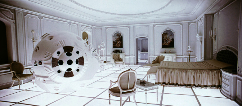
The sets of Stanley Kubrick’s hypnotic 2001: A Space Odyssey (1968), remain to haunt the imagination of interior designers and furniture makers dreaming of escaping earthly restraints. You need only look at the work of, say, Marc Newson to see how the future style that Kubrick manipulated and celebrated on celluloid in the light ’60s has landed again 50 years later.
The interior of the Orbiter Hilton, a high-tech fantasy circling high among the stars, was the apotheosis of the clean functional air-conditioned and virginal white office and hospital Interiors of mid 60’s America.

But what gave Kubrick’s sets a memorable twist was the imaginative use of his art directors Tony Masters, (Harry Lange and Ernest Archer) made of little-known contemporary furniture. The blood-red Djinn sofas designed by Oliver Morgue (for Airborne France 1965) that appear to float above the gleaming white floors of the Orbiter Hilton foyer are as much stars of 2001 as Hal, the mad, bad computer, and the music of Richard Strauss.
In 2001, Kubrick gave us a vision of Future Style that, despite nearly 30 years in orbit, still looks as inspiring as Earthrise seen from the Moon.
Prospero’s Books

Many of the most inspiring rooms you will ever see, you never enter, are found not in real life but in paintings.
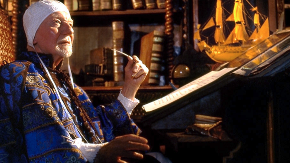
Peter Greenaway brought Antonella de Messina’s St Jerome in his Study to life (you can see the original in the National Gallery, London), and brilliantly so, as the core of Prospero’s books (1991), his complex interpretation of Shakespeare’s The Tempest. John Gielgud as Prospero took the place of St Jerome, bringing a Renaissance set piece to artificial life on the screen.
For anyone who loves the idea of framing interior views or who has a passion for Infinity mirrors, baroque cartouches, visual trickery and voluptuous sensuality, Greenaway is the ideal director. Or decorator. The art directors of Prospero’s Books were Ben Van Os and Jan Roelfs.
Fellini’s Roma

Look at this. Post-modern or what? But dating from nearly half a century ago.
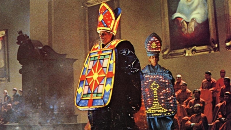
Federico Fellini was a master of post-modernism -using knowingly self-referential design and to keep absolute control of filming conditions, he made most of his movies in studios, notably the famous Cinecitta in Rome – an odd choice given the fact that Rome itself is a glorious set on which to stage scenes of…life in Rome.
Fellini’s Roma (1972) was a triumph of early post-modern design, with layers of visual imagery drawn from Roman history, yet all of it is interpreted in a highly personal and idiosyncratic way by the director.
Fellini’s cut and paste sets made the familiar surreal, and in doing so encouraged Italian design to try the same thing with interiors.
Performance

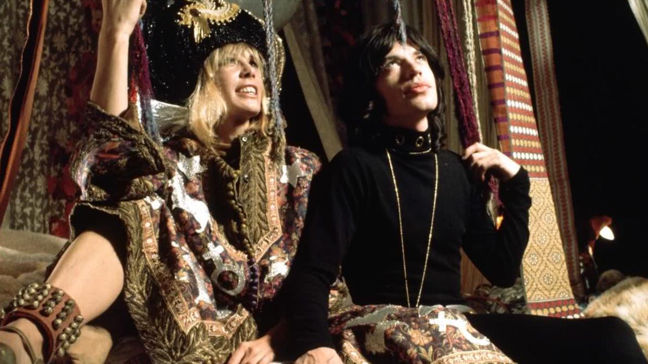
The nest of sumptuous rugs, fabrics and cushions that featured prominently in the sets of Nicholas Roeg’s Performance (1971) were gleaned from the smart hippie trail that led from Katmandu to North Kensington via Istanbul and Marrakesh.
It’s a style that has come back in the past few years as a new generation of financially cushioned-babes have an adopted the Souk look in a fresh search for exotica and sensuality.
Christopher Gibbs designed the sets with an obvious relish; they really are raunchy in a kind of slightly dirty heat rumpy-pumpy, joint-before-breakfast way.
Gibbs, court decorator to Rock royalty, created a look with art director John Clark that vanished quickly in a puff of reefer smoke, but which has now trekked back into our line of vision.
